Tamil creatives are creating a dialogue between tradition and modernity.
Finding homes.


In its broadest sense, identity has become a powerful cultural marker, serving as an expression of heritage and a response to globalising forces. This dynamic is especially poignant for Tamils from India and Sri Lanka, who balance honouring ancestral customs and adapting to new cultural landscapes.
In the arts, Tamil identity is reflected through cinema, music, and visual storytelling, often grappling with themes of displacement, belonging, and nostalgia. Artists from this community often blend classical Tamil forms with contemporary techniques, creating a dialogue between tradition and modernity.
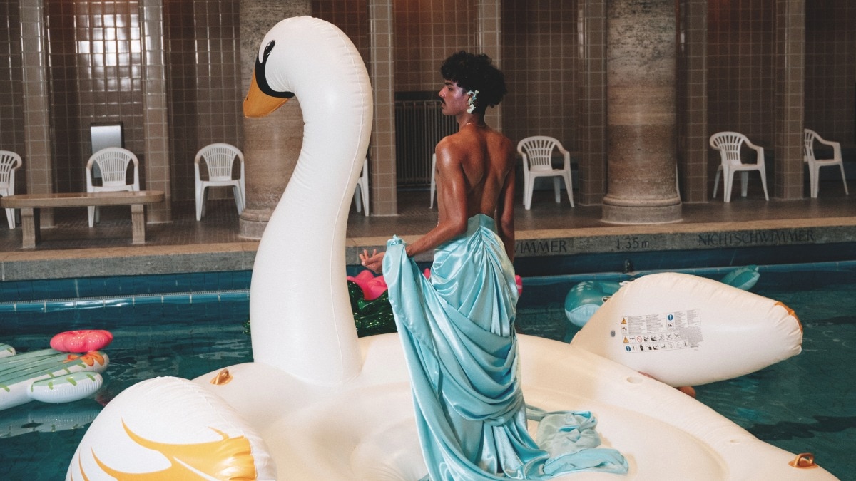
In her own kitschy, playful way, fashion designer Abarna Kugathasan holds on to her identity. Raised in Pforzheim, a small city in southwestern Germany, Kugathasan recalls growing up in a “very German flat but not so German household”.Tamil influences merged with German ones, whether in furniture, home decor, food, or clothing, and these contrasting cultures coexisted within her home. “From plastic banana trees and foamy artificial flowers in our living room to portraits of Hindu deities in picturesque landscapes hung up on our walls and sacred altars surrounded by the scent of incense,” she says. Kugathasan’s parents, who moved from Jaffna, Sri Lanka, in the 1990s, met in Germany.
The Tamils from Jaffna, located in the northern region of Sri Lanka, form a distinct cultural and ethnic group with deep historical roots. As the heartland of Sri Lankan Tamil culture, Jaffna has long been a centre for Tamil literature, Hindu religious practices, and classical arts like Bharatanatyam and Carnatic music.The region’s identity is heavily shaped by its colonial history and the Sri Lankan Civil War (1983-2009), which left a profound impact on the Jaffna Tamil community in terms of both displacement and resilience.
Kugathasan’s mother is a trained tailoress specialising in traditional Tamil attire, and she grew up watching her sew clothes at home. She often found herself in the living room, surrounded by metres of colourful silk, observing as her mother sewed and draped saris for the women of their neighbourhood. In many ways, she was practically raised to express her identity through fashion.
“When exploring my cultural identity, I realised I felt at home within the ‘plastic fantasy’ my parents had created,” says the 28-year-old designer. So, her labour of love, Kitschy Couture, is dedicated to that paradise filled with images of Hindu gods, plastic banana trees, and foamy lotus flowers, creating a whimsical world distinct from anything currently out there. In fact, through her label, Kugathasan pays homage to how her mother draped saris. Her designs are also heavily influenced by the sexiness of lingerie, aiming to empower women and give them agency over their sexuality.
“Some may consider it sacrilege to use the word sari in the same sentence as my work, but I mean no disrespect. My label is an evolved extension of my roots—cool, yet, deeply rooted in tradition. Many might not see it that way,” she admits.
Staying Rooted

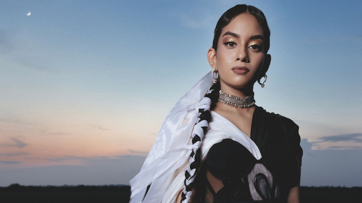
For London-based model and advocate Sheerah Ravindren, too, identity is imbued in her creative pursuits. For her, it is an ever-changing and nuanced concept, not a fixed idea. “It [identity] is shaped by various influences, not only my Tamil heritage but also my experience as a British Tamil person. Growing up, I initially saw identity as singular and monolithic, but over time, as I learned and unlearned, I became more comfortable with it, realising that my Tamil identity is personal and mine to affirm,” she says.
Ravindren often felt like an outsider in the UK, not just among South Asian kids but even among Tamil kids, as her upbringing in a liberal, creatively focused household was quite different from the more academically or religiously driven paths of many brown kids. Her parents moved to London from Sri Lanka in the early noughties, leaving her grappling with a new identity. As a model, Sheerah recently booked shows at Berlin Fashion Week. She’s also a champion of the underground music scene in London, supporting punk and alt rock, among other genres. And has been vocal about issues that govern the fashion and creative industries.
Her aesthetic is a pastiche of prints, textures, and proportions. She celebrates her body, her skin colour, and has been unapologetic about sporting body hair. “Growing up, I often looked at campaigns, films, and music videos where I didn’t see faces like mine. That lack of representation made me feel invisible, spurring me to seek out representation for myself. Having a different skin colour in an environment that wasn’t always appreciated, motivated me to create spaces where people like me could be seen and valued,” says Ravindren.
All About Community

Closer home, Mayank Bhutra, the founder of Erode Clothing, has always struggled with his identity. Born in Rajasthan but raised in Tamil Nadu, people often called him ‘vadakan’—a derogatory term used for people from the north of India—making him feel like an outsider despite living there. “This duality has been a constant part of my experience, shaping how I view my place in both cultures,” he says.
Keen to explore his roots and create something tangible that celebrated it, Bhutra started Erode in 2023, a cultural luxury brand that challenges rigid tailoring perceptions and gender stereotypes.“Our innovative designs encourage individuality and fearless self-expression through boldsilhouette patterns. Committed to opposing fast fashion, we create unique, meaningful clothing that embodies the past, present, and future,” he says.
The Bhavani Jamakkalam, a traditional textile with a GI tag from Tamil Nadu’s Erode district, is sadly nearing extinction, but Bhutra and his weavers are committed to preserving the craft. Erode’s designs blend retro styles with modern sensibilities, from silk blazers to co-ord sets, all infused with motifs that honour its heritage. The brand also innovates with traditional materials like silk, drawing inspiration from Tamil temple sculptures to create unique pleating silhouettes. “The key message I want to convey to upcoming brands is that if you choose a craft, stick with it long enough to impact the artisans and their craft. It’s about giving back to the community and ensuring the craft thrives, not just leveraging it for temporary gain,” says Bhutra.
Flow & Curve

Calligraphy has not traditionally been a part of Tamil history in the same way as it has been for other cultures, as the Tamil script was historically inscribed on materials like palm leaves rather than paper. Ancient Tamil manuscripts were etched with a stylus, making the art of writing more about engraving than flowing strokes.The introduction of calligraphy tools, such as a nib typically used for Latin scripts, presents an interesting challenge when applied to Tamil. It requires understanding not only the mechanics of the tool but also adapting it to the unique curves, forms, and structures of the Tamil alphabets.
Chennai-based graphic artist Karthiknathan S wants to change this notion. But even as he delves deep into research, he admits that there are only a few resources or books specifically dedicated to Tamil calligraphy or even Indic calligraphy as a whole. “The challenge lies in discovering the right techniques and materials to approach it effectively. It’s about navigating a lack of established guidelines and finding the appropriate tools and resources to start learning and developing this art form, which remains largely unexplored in the Tamil and broader Indic cultural context,” he says.
But long before he became preoccupied with his current purpose, Karthiknathan’s project for the annual DakshinaChitra NXT Langfest 2024 in Chennai got himnoticed. It featured a redesign of several iconic book covers, incorporating unique Tamil type motifs. It highlighted hisdedication to thoughtful design, with each cover serving as a testament to his creative skill and attention to detail.
Each book cover was designed to reflect the personality of the subject, with a focus on title lettering and subtle design elements for context. Think, a layout inspired by MS Blue with a sari-inspired design, incorporating the title into the zari and a stitched silhouette of MS Subbulakshmi to a modern Art Deco style designed to look like a stencil on a ship’s hull.
“This journey began when I was talking with friends about language and how, in India, many people think in English. Despite speaking English at work and school, I realised that I always thought in Tamil first, and this connection to my mother tongue became something I felt strongly about,” he says.
As Karthiknathan explored design through his personal practice, he became fascinated by the forms of the Tamil script—whether in movie posters or stone inscriptions. “This curiosity, combined with my love for pop culture, has deeply influenced my creative practice,” he says.
Lead image credit: Nichlas Hasemann
This article first appeared in Bazaar India's October-November 2024 issue.
Also read: What Bhutan’s Gross National Happiness index says about its queer community
Also read: Book industry insiders share how to choose your next favourite read


